 any-device
It's one of the most frustrating experiences in corporate life. You've identified a challenge endemic to your sector. Your team has pinpointed causes and researched solutions. You know where the competition stands and have defined a clear area of opportunity. If you act fast, you'll not only avert a downturn but energize your company to rise above, to take your place at the top.
Memos are e-mailed, meetings scheduled. You present your data to the powers that be. Management is in agreement. Everybody and their cousin buys in. And then, nothing happens... They liked the idea, but obviously didn't see your vision of the real opportunity. The downturn hits, just like you knew it would. The company muddles through. What happened? You reached for the stars, only to be stymied by a failure to launch.
In considering why, you might do well to consider the power of data visualization. Data visualization helps to clarify the real business value of the data in a way that can be easily understood, without having a deep understanding of the complexity behind problem or the solution. Simply stated, data visualization is a means of conceptualizing information as charts, graphs, and visual plots, and designing useful, accurate visualizations is a calling unto itself.
In our increasingly data-driven world, visualization helps managers and innovators actualize their big ideas. Data visualization regularly helps companies identify new market opportunities, improve customer experience, gain insight into customer behavior, increase operational efficiency, and so much more.
Why is visualization so necessary for creating these important changes? Failure to visualize often leads to a failure to act. It's not hard to understand why. Humans are visual animals. On a basic level, sight spurs us on more than all the other senses. While the roar of a lion may inspire atavistic terror, how much more visceral is the sight of that lion leaping towards you, claws bared and jaw distended? As survivors, we're programmed to ponder sounds. Seeing a lion in mid-flight makes us go, go, go!
In his TED Talk of July 2010, Information Designer David McCandless explained the power of data visualization. After displaying an infographic from physicist Tor Norretranders that likened the bandwidth of the human eye to that of a computer network, McCandless said, "The eye is exquisitely sensitive to patterns in variations in color, shape and pattern. It loves them, and it calls them beautiful. It's the language of the eye. If you combine the language of the eye with the language of the mind, which is about words and numbers and concepts, you start speaking two languages simultaneously, each enhancing the other."
McCandless' analogy is apt because visualization is our means of conceptualizing data as something more meaningful than abstract "words and numbers". Such abstractions have trouble communication urgency to the brain. Often, this is due to the sheer volume of information. Without some means of making data more digestible to the audience, patterns stay hidden and trends fail to emerge. Because visualization provides context, it helps us assign meaning and importance to the data and understand patterns and trends within the mass of information.
An example of the power of data visualization
According to Wikipedia, there were a total of 52 films in the superhero genre released between 2006 and 2015 for which there are both critical ratings via rottentomatoes.com and box office receipts. The total box office for these films was $20,751,501,614. That raw figure is enough to suggest that superhero movies are big business, but it says little to nothing about industry trends. Consider this sample data:
Here we see the top 5 superhero films in terms of box office, coincidentally each a billion dollar earner.
Year: 2012
Title: The Avengers
Box Office: $1,518,594,910
Year: 2015
Title: Avengers: Age of Ultron
Box Office: $1,405,413,868
Year: 2013
Title: Iron Man 3
Box Office: $1,215,439,994
Year: 2012
Title: The Dark Knight Rises
Box Office: $1,084,439,099
Year: 2008
Title: The Dark Knight
Box Office: $1,004,558,444
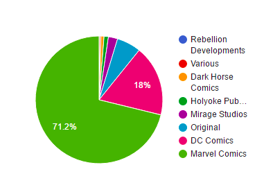 Pie Chart Data Visualization
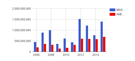 bar data visualization
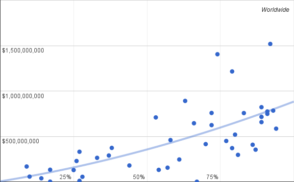 Scatter Plot Data Visualization
Aside from 2012 being a banner year for the genre, all the data suggests is that the public appetite for sequels is robust. Hacking through the data reveals much more, but brings us back around to our premise. Aside from the data hacker herself, is it likely that the more intricate transformations will make an actionable impression on the observer's mind? Now consider an expanded data set in visual form: Here we see box office compared per year. The highest grossing superhero film of each year populates the MAX lines in blue, while the orange AVG lines show the average take.
By this measure we can note a clear trend towards a steady market, after a dip in the 2009-2011 range. Our billion dollar leaders are clearly outliers, though they do agree with the general trend. While it's possible to infer this information from the raw data, visualizing the data allows us to make the important comparisons automatically. The numbers themselves are barely of import. We need only notice the color bars and their relative heights to understand what is being conveyed. Evaluating financial data has becomes as elementary as evaluating a piece of fruit. Were you an investor in superhero film properties, where would you be wise to invest your money?
Using the same data set, but different columns, we can compare the box office of all superhero films for the target period with the origin of the properties those films adapted: Of immediate note is the dominance of Marvel Comic properties. This is somewhat surprising given our first table. Despite DC Comics holding two of the five billion dollar spots, they commanded just 18% of the market share over the target years. A simple scatterplot shows us the relationship between quality and performance: Here box office is plotted vertically with Rotten-tomatoes aggregate ratings horizontal. A strong correlation is displayed between billion dollar performers and critical reception above 75% positive, which doesn't bode well for DC Comics' newly released Batman v Superman.
How long would it take to glean this data from examining the raw figures? How deep an impression would it make on the mind? Using simple visualization tools not only accelerates the speed at which we are able to comprehend this data, it makes the data more salient to our visually biased minds.
Data visualization is a powerful tool because it leverages our remarkable ability to process graphical information. Numbers are at the heart of the business universe, but numbers are meaningless without context. Visualization provides context in the manner most likely to inspire decision makers to absorb information and take appropriate action. The next time you're faced with diverting a crises or seizing an opportunity in your market, consider the power that data visualization tools can bring to your presentation.
Sources: McCandless, D. (2010, July). The beauty of data visualization. Retrieved March 26, 2016, from http://www.ted.com/talks/david_mccandless_the_beauty_of_data_visualizationVisualizations created using Google FusionTables.Data sourced from https://en.wikipedia.org/wiki/List_of_American_superhero_films and linked articles.
Data visualizations provide powerful business insights.
Read our complete guide to data visualization tools for business owners.