Let's first agree that when presenting information to an audience, presumably your intention is not to deceive. By providing an illustration, a chart, a graph, or some significant video detail, you are likely endeavoring to make something clearer to the audience. I'll tell you why I mention this below.
I often talk about Astronomy, and try to persuade people about the size of things. From the International Space Station you cannot take in the entire planet Earth at a glance; it is so large you have to move your head and your eyes around in order to be able to see the face of the whole planet.
If you see a tiny mote of dust in a sunbeam, that is about halfway between the size of our planet, and an atom. That analogy helps you grasp just how small an atom is. It works because I've described something you can readily imagine.
To give you a grasp of Universal scale I need something more. I can't describe the nearest 400,000 galaxies, where each fuzzy patch would take light from 30,000 to 60,000 years to cross, or where each dot contains billions of stars. But I can show you a video where every spec of illumination, even those in the far background, is a galaxy. And yet this shows (accurately) only 1/250,000th of the entire Universe as we currently understand it. Have a look, and I'll wait here for you to return… (By the way, the video is silent because… well… space…)
Imagery, Charts, and Graphs are proven to be more persuasive
I referenced personal integrity in the first paragraph because if your intent is to persuade, Cornell University researchers revealed in a 2014 study that the simple presence of a graph accompanying a scientific claim was sufficient to convince 97% of people to believe that the information was accurate and truthful. People subjected to the same information, but without the graph, only rated the veracity at 68%.
The results were similar when they were presented with a chemical formula. Using a chart to put something within a "scientific context" was sufficient to convince people that it was more believable even when the chart/illustration/graph or whatever contributed nothing to clarification of the subject. Its mere presence was enough to persuade.
Visualized data incites increased action
Part of our responsibility to provide visual evidence in our presentations. However, because visual data is proven to engage the human brain so easily and efficiently, it becomes even more important for us to use precise and salient visual data, and make sure that it is thoroughly understood. People draw conclusions from visual information much quicker than they do from written information, so when creating accurate visualizations we must consider any assumptions that could be quickly made from looking at the visualization and adjust the visualization for accuracy.
As an example of the effectiveness of visualization to incite action, if you had the spread sheet below in front of you alone, it probably wouldn't incite any dramatic action on your part unless you did some work and really took time to digest the information; spreadsheets are typically dry and dull and nothing about them conveys urgency or a reason to be concerned.
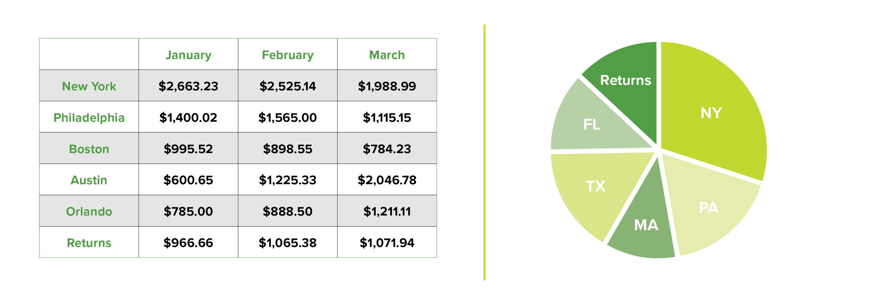
But placed in a pie chart, suddenly it becomes apparent that you have a serious problem- in every jurisdiction you're experiencing a 15% return rate on your sales. Something is seriously wrong! You need to get people on this right away! The amount of returns are greater than sales for the whole Massachusetts region! This realization occurs because it is suddenly apparent with a visualization that a massive chunk of your profits is vanishing. A loss of that magnitude could wipe out a company in fairly short order. Black and white data on a spreadsheet suddenly jumps out at you when shown in a chart form.
The Takeaway
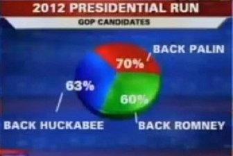
When we see a chart or a graph we automatically assume that people have done some work. We believe that they are as meticulous as we are when we do our work. But how many times have you seen sheer idiocy because some people don't know how to use presentation tools, or possibly do not understand basic mathematics?
This particular screen grab from the 2012 election speaks for itself I think. If it's a bit fuzzy because of the size, I'll point out that it totals up to 193%—which is slightly more than 100%...
So make a point of using good data, and make sure your audience understands it. You don't want people to assume that you're correct; you want them to know that what you say is true; that it is substantiated by evidence. You owe it to them, and you owe it to your business to represent the data accurately through any visualization.
Make better decisions for your business.
Check out our complete guide to data visualization tools for business owners.