

Congratulations! You’ve succeeded in collecting a massive amount of valuable data about how your business functions and stored it in a data warehouse that fits your business’s needs perfectly. Now comes the challenge of organizing it in a way that showcases important insights in an easily digestible way, allowing your team to make data-driven decisions.
Technically, you can type out the main points after analyzing that data and distribute that information as needed…but this is rarely an effective method when it comes to making a lasting impact. Visualizations tend to be far more effective. Research has shown that visual explanations help to increase understanding and result in better learning outcomes. This is why it’s important to utilize good data visualization.
Making the Most out of Good Data Visualization
Data is powerful, but only if the people using it understand what it’s saying. Making effective data visualizations involves presenting data clearly, choosing the right type of data visualization or chart for the particular situation and audience, and avoiding misrepresentations. For example, the best data visualizations...
- don’t overcomplicate charts with excessive or unnecessary labels,
- use charts or graphs that highlight the most important parts, like total sales, and
- start their axes at zero so their numbers don’t appear inflated.
Often, simpler is better. The quicker your audience understands the points you’re trying to make, the less time they spend doing mental gymnastics to figure out what they are looking at. This ultimately streamlines the presentation and makes a bigger impact. The teams using the data can be more confident in their understanding and make truly informed decisions.
Examples of Great Data Visualization
Talking about what a chart or graph should look like isn’t exactly effective. So, what does great data visualization actually look like? Here are some examples of the data visualizations that really get their point across and how they might be used.
1. Apple’s iPhone Quarterly Revenue Column Chart
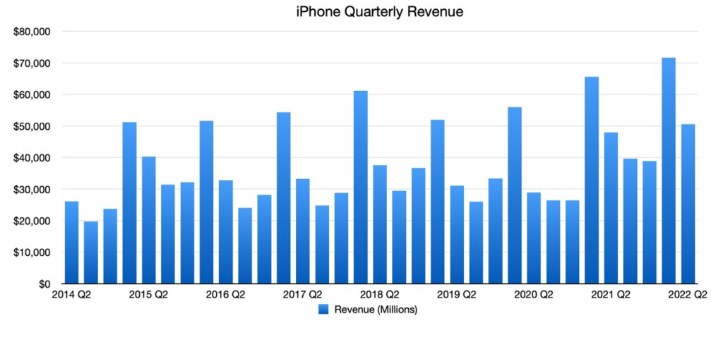
Why it’s great: Most people learn about column charts in their elementary math classes. This actually makes them a great data visualization tool because you can rest assured that the vast majority of viewers will quickly understand what they mean. They can also be a good way to show how something varies over time. Here, Apple shows their iPhone revenue by quarter. The chart is simple and avoids over labeling.
What it’s saying: In this chart, we can quickly make out how iPhone revenue changes over time and pick out some trends. The first thing most people will notice is that there is a large spike in revenue in Q1 every year. The quarter directly after this is still a little higher, but closer to the rest of the year.
Also, we can see that revenue has been relatively stable over the years, with an increase in 2021 and 2022, likely due to inflation. From here, sales teams might choose to focus on increasing Q3 sales, where we see they are experiencing the lowest revenues most years.
2. Tesla’s Vehicle Delivery History Line Graph
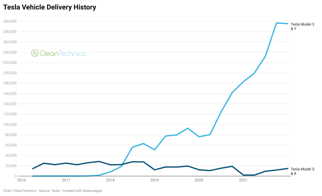
Why it’s great: The line graph, like the column chart, is exceedingly simple and most people are familiar with them. They are also great for showing changes over time. Here, Tesla focuses on two groups of models and how their delivery numbers have changed over time. The graph is not over crowded and most people can very quickly make out the main point here.
What it’s saying: The big statement here is that the delivery demand for Tesla models 3 and Y began overtaking the delivery demand for Tesla models S and X in 2018 and quickly became far more popular over the next few years. It also appears that the delivery demand for Tesla models S and X is poor overall. The company might consider dropping those models or attempting to increase their popularity.
3. Spending Benchmarks of Saas Companies with More Than $20 Million in ARR Pie Chart
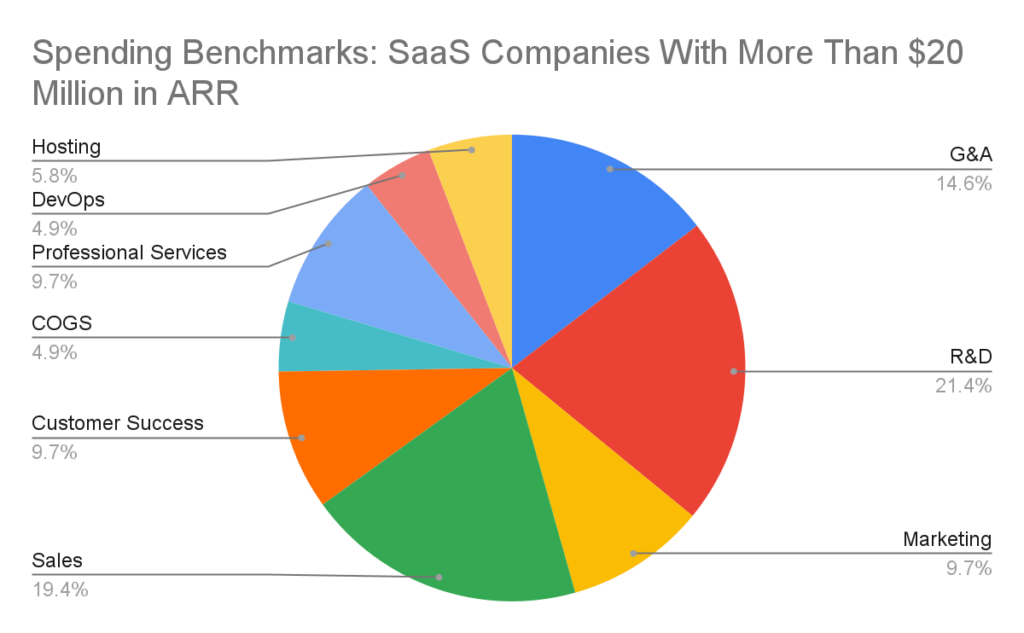
Why it’s great: Pie charts make for good data visualization due to their simplicity. They provide an intuitive way to show how many parts make up the whole and how big each part is. This pie chart shows us spending benchmarks of SaaS companies with more than $20 million in annual recurring revenue (ARR). The different sections are all in distinct colors and there aren’t so many categories that the chart is unintelligible, meaning the labels are easy to read and it is easy to differentiate the spending benchmarks.
What it’s saying: Here we get a good breakdown on how these successful companies spend their money. We immediately notice that the biggest expense for these companies is research and development, followed by sales. This might be helpful in guiding a smaller SaaS in their budgeting.
4. Website Conversion Funnel Chart
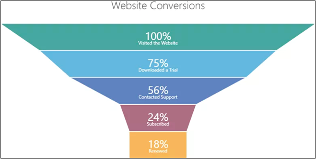
Why it’s great: Funnel charts are frequently used to provide a visual representation of sales pipelines. It’s a simple way to show how many customers are lost at different points along the pipeline (or where they leak out, so to speak). This funnel chart is easy to read and clearly represents the proportion of customers lost since the last point with both the size and label.
What it’s saying: This chart shows us that the company loses the most customers between downloading the trial and contacting support and also between contacting support and subscription. We also see that most subscribers actually renew. From here the company might decide to investigate the support layer to see what could be improved.
5. Netflix Subscriber Area Chart
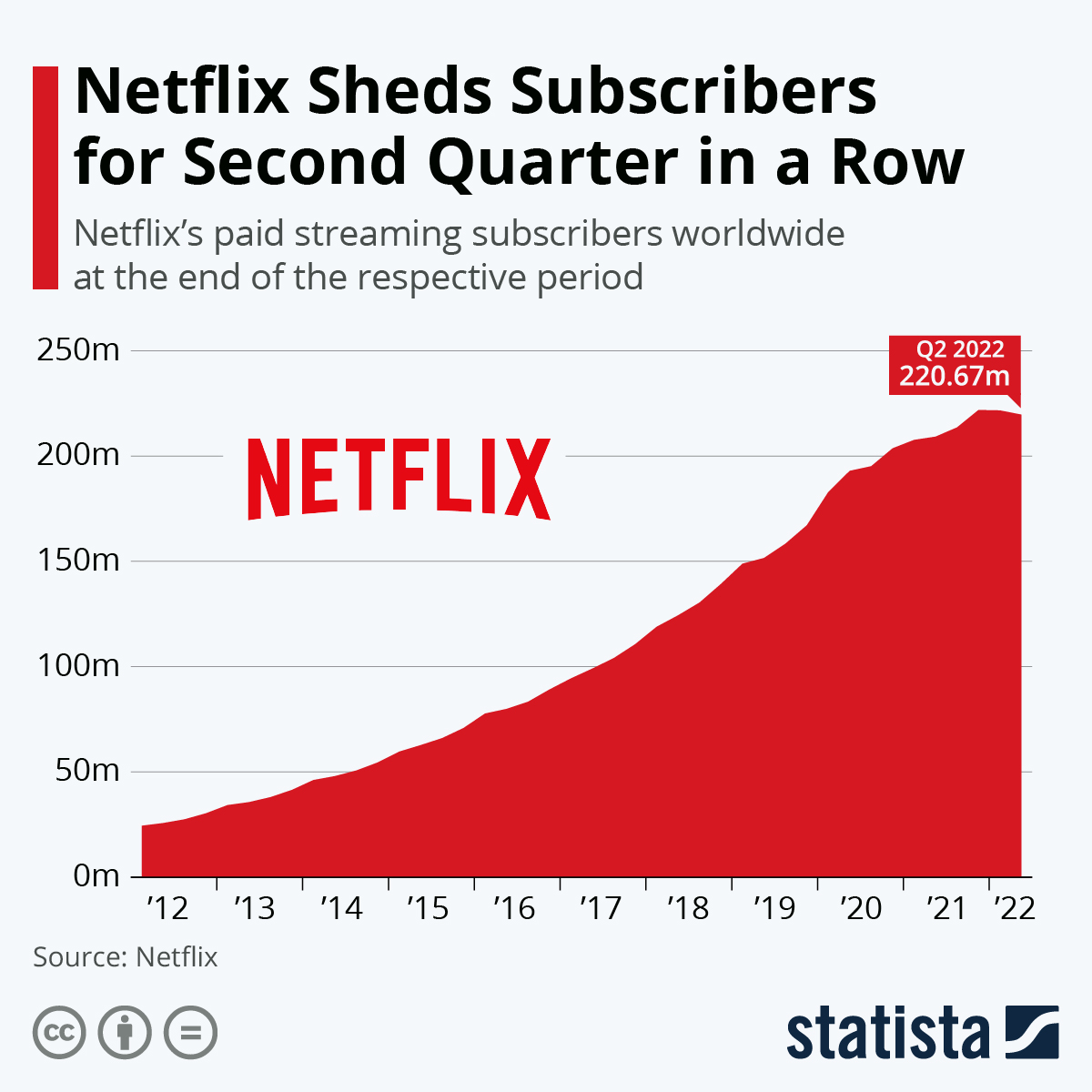
Why it’s great: Area charts are great for showing trends over time or visually indicating growth and decline. This bold chart is very easy to see and labeling is simple.
What it’s saying: Netflix obviously experienced significant growth for almost a decade, but suddenly showed signs of a slight decline in 2022. This is likely due to the increase in competition at the time, forcing the company to step up its game in order to keep up.
6. Yearly Revenue Waterfall Plot
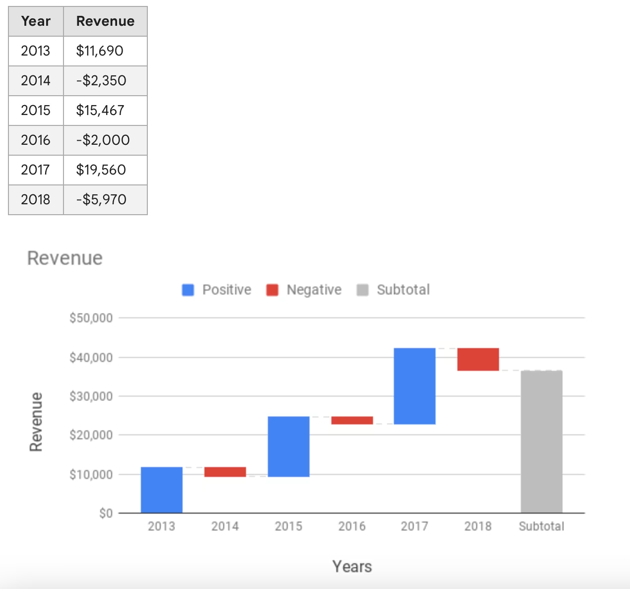
Why it’s great: Waterfall plots are helpful for visualization of data where there is a kind of running total which is added up at the end. The end of each bar on the y-axis indicates where on the y-axis the next bar starts. Here, we can easily see which years had a gain in revenue and which years showed a loss in revenue. The subtotal is shown in a different color to avoid confusion.
What it’s saying: Overall the company has made money (around $36,000), but they lose money every other year.
7. Technology Market Bubble Plot
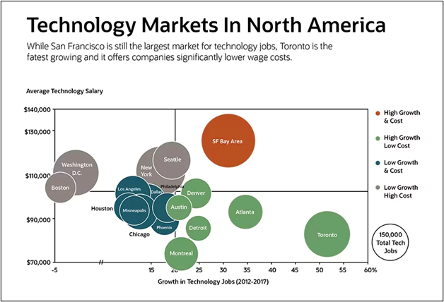
Why it’s great: Not all good data visualizations have to be super simple, especially when the teams using the data are used to a more data-driven work culture. Bubble plots are useful for showing relationships between three variables. This plot clearly shows the relationships between salaries, job growth, and the size of different markets, while still appearing clean and easy to read. Here, the markets are further categorized into quadrants representing low growth/high cost, high growth/high cost, etc. This helps to immediately discern which markets fit some given criteria.
What it’s saying: SF Bay immediately sticks out as the largest market here for tech markets, but Toronto appears to be the fastest growing market. However, Toronto is also a relatively low salary market.
8. AdventureWorks Data Dashboard
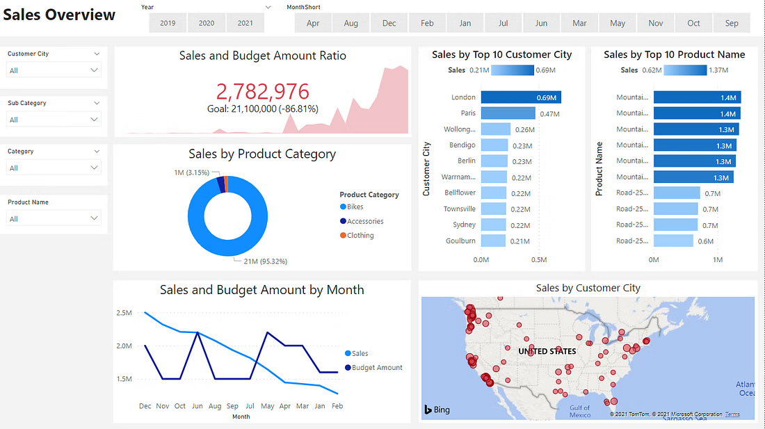
Why it’s great: Usually one chart or plot won’t tell the whole story. This is where data dashboards come in. Data dashboards allow users to combine all the meaningful charts and data into one big picture view of a business and make insightful decisions from there. This data dashboard combines many of the great data visualization types mentioned above in a clean way that allows the user to quickly find what they need.
What it’s saying: In general, data dashboards provide a lot of information in one view. This dashboard shows decreasing sales, but also showcases the biggest markets and best-selling products for the company. It can give the viewer insights on where to focus efforts to increase sales.
Turning Good Data Visualizations into Great Data Dashboards
Putting together a useful set of good data visualizations is crucial for setting your business up for long term success. Data visualization tools, like Tableau or Power BI, help organize this impactful data and set up the dashboard that works best for your business.
At CSG, we help businesses drive efficiency, innovation, and growth. We believe in empowering businesses to make data-driven decisions by leveraging their own data in ways tailored to fit their goals and needs. Contact us today to find out more about turning your data into a powerful tool or check out how we’ve empowered other companies to leverage data visualization tools.